Urbest
Brand strategy & Brand identity
Charting Urbest's strategic course to stand out
Urbest, a facility management software provider, faced fierce competition in Europe. Our challenge was to identify their core differentiation and emphasising it into a bold strategy.

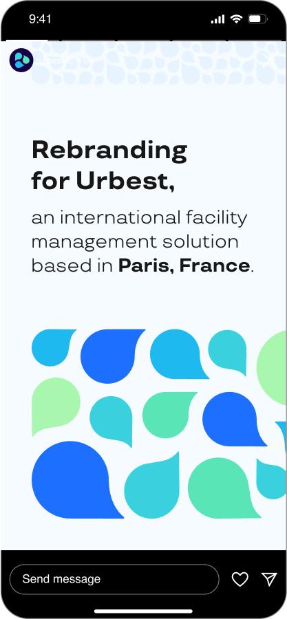
Rebranding project.
HQ: Paris, France.
HQ: Paris, France.
The challenge
From a Tool to a Brand
Urbest came to us with a product, not a brand. They had a promising communication tool, but no clear strategic vision for how to compete. The facility management (FM) sector, their target market, was fundamentally fragmented and buried in outdated processes—a chaotic mix of endless email chains and untraceable phone calls. While the Urbest tool had the potential to solve some of these communication issues, the larger strategic challenge was to define what Urbest could, and should, become. The task was to elevate it from a piece of software into a brand that could stand for something meaningful in a complex ecosystem.
Urbest came to us with a product, not a brand. They had a promising communication tool, but no clear strategic vision for how to compete. The facility management (FM) sector, their target market, was fundamentally fragmented and buried in outdated processes—a chaotic mix of endless email chains and untraceable phone calls. While the Urbest tool had the potential to solve some of these communication issues, the larger strategic challenge was to define what Urbest could, and should, become. The task was to elevate it from a piece of software into a brand that could stand for something meaningful in a complex ecosystem.
Brand Research
Our first step was a deep diagnostic of the market. We engaged directly with the key players: real estate owners, property managers, and service providers. Initially, the goal was to understand how to best position a new communication tool. However, our research uncovered a much larger, more significant opportunity.
Our diagnosis revealed the core problem wasn't merely a lack of communication, but a fundamental lack of integration. The entire facility management process was a disconnected ecosystem where the distinct needs of owners, managers, and service providers created constant operational friction.
This research was the turning point. We saw the potential for Urbest to be far more than a simple communication tool. The real value lay in building a holistic digital ecosystem that could connect all these players and streamline their operations. We presented this vision to the Urbest team: the opportunity wasn't just to improve communication, but to fundamentally simplify facility management.
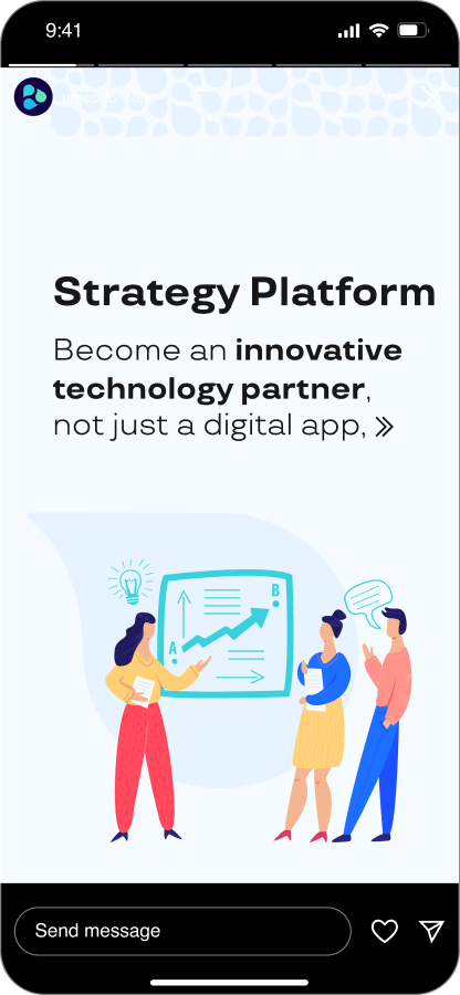
Brand Strategy
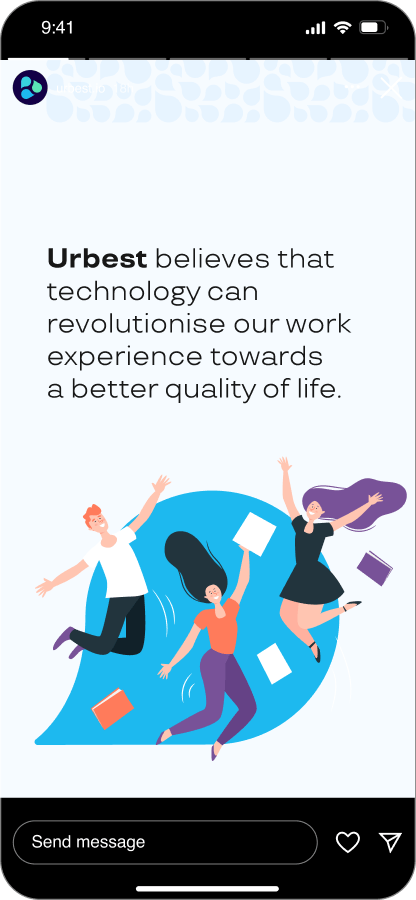
With this new, ambitious direction established, we built a robust brand strategy to guide every decision. This was about defining what Urbest stands for, who it serves, and why it matters. The strategy was built from the inside out, starting with a core purpose: the belief that technology can revolutionize our work experience to create a better quality of life.
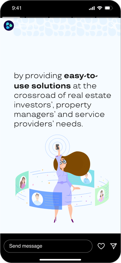
This purpose informed Urbest's role as the (g)local technology partner for real estate owners and managers. Its mission became to simplify property management by integrating a network of verified service providers, modern software, and field expertise into a single, easy-to-use platform. This gave Urbest a distinct and defensible position in the market, transforming it from another software product into a comprehensive solution. The core of the brand strategy was to cultivate a specific perception in the customer's mind: Urbest as "My Personal Troubleshooter." This is a brand that feels almost magical in its ability to make complex problems disappear, wise in the solutions it provides, and grounded enough to be accessible and easy for anyone to use. The entire strategy was distilled into a simple, powerful essence: Simplify Future.
This purpose informed Urbest's role as the (g)local technology partner for real estate owners and managers. Its mission became to simplify property management by integrating a network of verified service providers, modern software, and field expertise into a single, easy-to-use platform. This gave Urbest a distinct and defensible position in the market, transforming it from another software product into a comprehensive solution. The core of the brand strategy was to cultivate a specific perception in the customer's mind: Urbest as "My Personal Troubleshooter." This is a brand that feels almost magical in its ability to make complex problems disappear, wise in the solutions it provides, and grounded enough to be accessible and easy for anyone to use. The entire strategy was distilled into a simple, powerful essence: Simplify Future.
Brand Identity
The next step was to translate the strategy into tangible brand assets. We developed a verbal and visual identity that served as a direct execution of Urbest's core principles: smart technology, user-centric design, and streamlined collaboration.
Defining a detailed tone of voice was particularly critical. For a brand needing to communicate with three distinct audiences (from corporate owners to on-the-ground service providers), consistency is paramount. A clearly defined voice—professional yet accessible, analytical but down-to-earth—ensures that every piece of communication, from a web page to an app notification, builds trust and reinforces the core promise of simplicity and reliability. It allows the brand to speak with authority without being intimidating, reflecting its role as an expert partner.
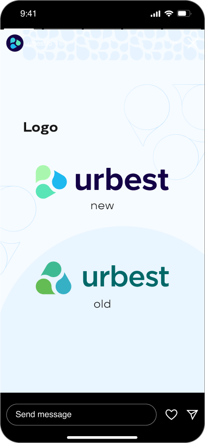
Visually, the identity is clean, modern, and human. The logo, for instance, uses interconnected speech bubble elements not just to cue communication, but to visually represent the seamless ecosystem at the heart of the brand's strategy. The vibrant color palette feels fresh and technological, while the chosen typography reinforces the brand's commitment to clarity and ease of use. Every element was designed to be a direct expression of the "Simplify Future" essence.
Defining a detailed tone of voice was particularly critical. For a brand needing to communicate with three distinct audiences (from corporate owners to on-the-ground service providers), consistency is paramount. A clearly defined voice—professional yet accessible, analytical but down-to-earth—ensures that every piece of communication, from a web page to an app notification, builds trust and reinforces the core promise of simplicity and reliability. It allows the brand to speak with authority without being intimidating, reflecting its role as an expert partner.
Visually, the identity is clean, modern, and human. The logo, for instance, uses interconnected speech bubble elements not just to cue communication, but to visually represent the seamless ecosystem at the heart of the brand's strategy. The vibrant color palette feels fresh and technological, while the chosen typography reinforces the brand's commitment to clarity and ease of use. Every element was designed to be a direct expression of the "Simplify Future" essence.
Urbest's name and “Simplify Future" tagline signal their purpose. Vibrant colours and geometric logo shapes convey their balanced blend of innovation and structure.
Using a modern font with a geometric appearance suggests sobriety and order. In combination with the brand’s vivid colours and dynamic illustrations, it gives a sense of balance and flexibility.
Website design
We’re also proud of the new design concept we’ve developed for Urbest’s web site. Thanks to its well structured and clean design, it improved that brand’s perception aimed by the new brand strategy.
result
Since implementing the rebranding, Urbest has expanded significantly across Europe. Their clarified strategy and identity accelerated success by highlighting their focus on user experience and network effects versus just features.
This project demonstrates our rigorous approach to uncovering and expressing brand differentiation. For Urbest, highlighting their core strategic value was instrumental to growth. Their progress validates how branding can drive change.
This project demonstrates our rigorous approach to uncovering and expressing brand differentiation. For Urbest, highlighting their core strategic value was instrumental to growth. Their progress validates how branding can drive change.
Rebranding Case Study — Urbest Facility Management. Brand Strategy & Brand Identity development.
Project details
Client: Urbest
Project Year: 2019
Country: Paris, France
Client Industry:
Facility Management SaaS
Deliverables
- Brand Research
- Consumer Segmentation
- Brand Strategy
- Visual Identity Redesign
- Verbal Identity
- Communication Strategy
Softia
Rebranding: Brand strategy, Brand identity, Employer Branding
EBS Integrator
Rebranding: Brand Consultancy, Brand Strategy, Brand Identity, Communication Strategy