Designing a Web3 Brand Identity That Isn't a Cartoon
Web3 brand identity searches stall near position 17 with no article of record to answer them. See how to design identity that reads credible, not a cartoon.
Open a web3 project's website and you can usually guess the template. A rocket ship, a robot, maybe a cartoon animal with a laser. The colours are loud, the wordmark is unrecognisable, and the whole thing looks like it was rendered by a hallucinating comic-book artist. Then the founders wonder why nobody treats them like a business.
I design brand identity for a living, and the crypto sector hands me the same brief over and over. They want a web3 brand identity design that looks exciting and trustworthy at once, which is a fair wish. The problem is that most teams reach for a cartoon to signal excitement, and a cartoon can never signal trust.
So this is about how to approach web3 brand identity design so the result reads like a credible venture, not a meme. Let me show you what the alternative looks like.
The genre problem
Web3 has developed its own visual dialect: holographic gradients, pixelated future-signs, winged mascots. It is a style so consistent that it has become a warning. When every project looks the same, visual novelty stops differentiating and starts delegitimising.
The deeper issue is what these symbols imply. A cartoon face says playful, unserious, disposable. For a consumer token that might be fine. For a fund, a protocol, or anything holding other people's money, it is actively wrong. The identity and the business model are contradicting each other in public.
What a trustworthy web3 brand identity design contains
Credible web3 brand identity design does not have to mean a grey corporate monogram. It means the visual system does honest work. It signals who you are, who you answer to, and how you behave, all without shouting.
Three ingredients do most of the heavy lifting. Restraint: fewer colours, fewer effects, more whitespace. Precision: a wordmark that is legible at the size of a favicon. Consistency: the same system applied everywhere, from the docs to the token page. None of that is exciting on its own. Together it reads as a team that can be relied on.
If you want the fundamentals behind those choices, our guide to what branding actually is explains the difference between a set of assets and a functioning identity.
A real case: OOST
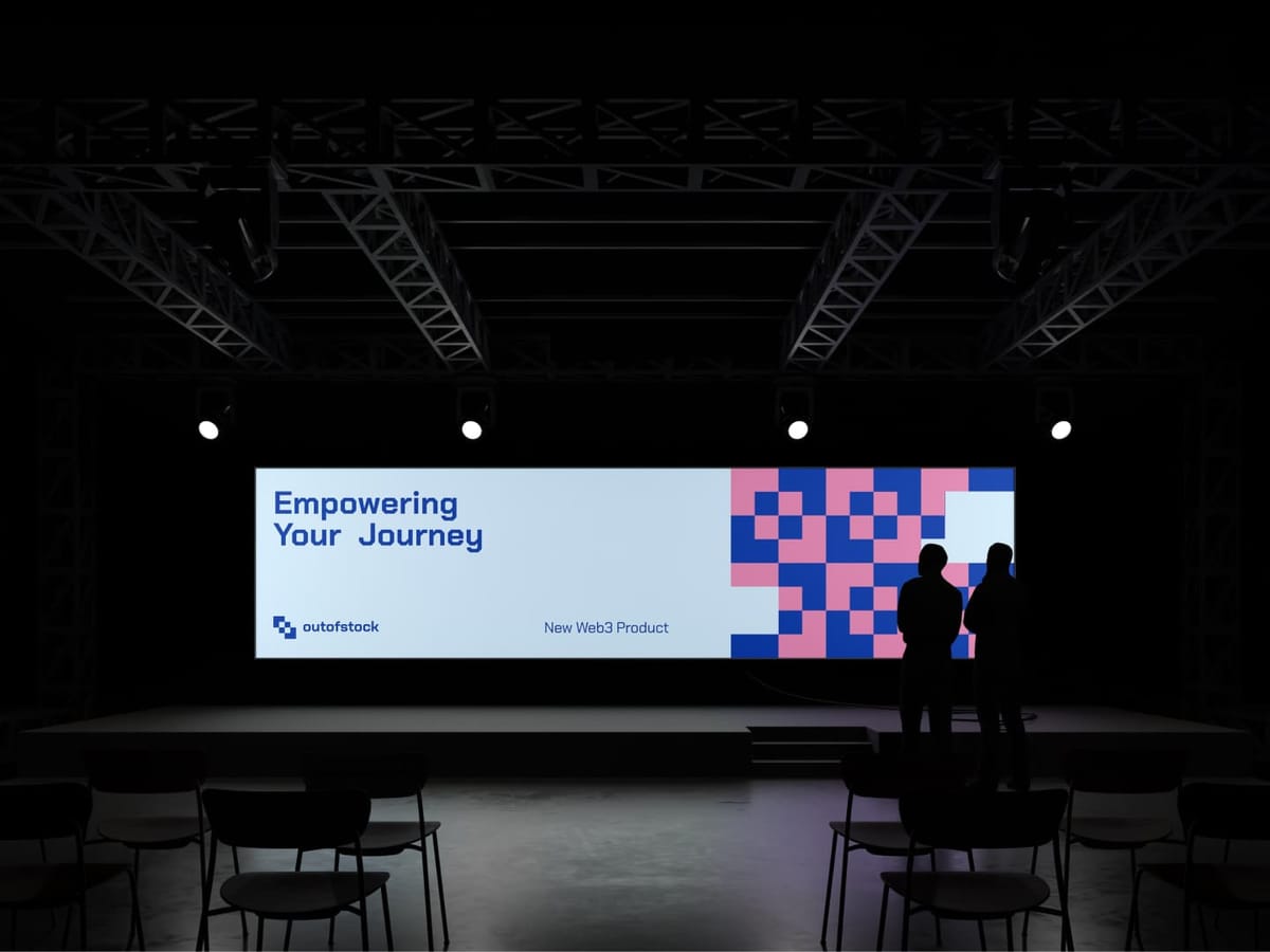
The best example I can offer is our work with Out of Stock Digital (OOST), a Swiss-based digital firm we rebranded for the web3 world. OOST holds a network of more than 150 venture funds, so their identity had to serve two masters. It needed the seriousness that makes institutional money comfortable, and the forward energy that signals they are not a legacy consultancy.
We anchored the identity in Swiss precision. That gave the wordmark a clean, engineered quality. Then we layered in the innovation, not through a mascot, but through motion and modularity in the system. The result was an identity with discipline at its centre and energy at its edges. The full story is on the OOST case study, but the short version is this: nobody had to be told it was a serious firm. The identity said it.
The rejection we kept hearing
Early in our web3 work, we heard the same pushback from founders. "That looks too plain. It will get lost." The worry is understandable, because the crypto feed is loud. But here is what we found when we actually shipped a quiet identity for a serious fund. The noise stopped mattering. The right investors noticed the calm because it was the only calm thing in the scroll. A restrained system cuts through precisely by refusing to shout.
People remember good work they can describe. They never describe a gradient. They describe a mark that holds its shape, a palette they could name, a page that felt considered. Those are the qualities that get repeated in rooms where funding decisions are made.
Principles to borrow for your own system
You do not need to copy OOST's look. You need its discipline. Four rules will keep your identity out of cartoon territory. Choose a restricted palette, usually two or three colours, and actually restrict it. Make the primary wordmark simple enough to read at 16 pixels. Give yourself a second, more expressive treatment for moments where play is appropriate, so play stays contained. And test every asset on a dark crypto wallet background, because that is where your identity lives.
Apply those rules and the identity stops competing with the noise. It starts earning a different kind of attention entirely.
What your audience is really judging
A web3 audience judges an identity on one unstated question: would I hand this team my money? Everything else is noise. That question is answered by coherence more than flash. A system that holds together across the whitepaper, the app, and the token page tells a careful reader the team holds together too. A system that shrugs off its own rules tells them the opposite.
That is why the design decisions above are not aesthetic preferences. They are signals about reliability, and reliability is the currency of this market.
The trap of the crowd
There is real pressure to conform. When every competitor has a neon gradient, plain feels like losing. I have sat through that exact conversation with founders, and the winning argument always comes back to the same point. Differentiation is not about looking different from the boring corporates you already distrust. It is about looking different from every other web3 project, which the cartoon route can never achieve, because you all end up using the same cartoon.
The studio's repeated experience is consistent. A web3 brand identity design that stands out does so through restraint, not decoration. The rarest thing on the internet right now is a calm, precise crypto brand. Be that rarity.
Where to start
If this resonates but you are stuck in the template, begin with subtraction. Strip your current identity back to one colour, one wordmark, one typeface, and look at what remains. The bones will tell you what you actually are. From there you rebuild with intent instead of layering more noise on top.
Credibility in web3 is scarce enough to be a real competitive advantage. An identity that signals trust, instead of a cartoon that signals hype, is one of the few ways to buy that advantage without spending a fortune. Design it like you expect to be audited, because these days you probably will be.
Related reading
How a Web3 Branding Strategy Earns Trust
Enjoyed this? Get the next one in your inbox
Branding insights from TARNOVSKI — no spam, unsubscribe anytime.